Surbiton Cycles — Ad Campaign Analysis
We’ve previously written about how Evans Cycles effectively targeted their audience through clever placement and timing of their advertising — their flyers hooked to the handlebars of bikes in the racks outside Waterloo station was a perfect example of “talking to your customers where they live”, and timed to coincide with the beginning of Spring and improved cycling weather.
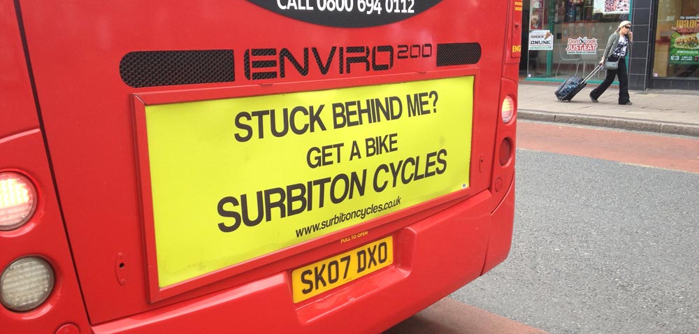
Well, here we have a go at another ad campaign analysis. Our subject this time is another good example from a different bike store — one local to us — Surbiton Cycles:

Customer pain points
What’s great about the above advert is the fact that it speaks directly to a customer’s pain point at the exact place and time it is happening. While a customer is sitting in their car, probably feeling hot and sweaty from the sun — and stressed because a giant red bus is obscuring their view and pumping black smoke in their general direction — this advert offers what the motorist yearns for the most: a freer way to travel.
Not every motorist could swap out their car or van for a bike, but for those that could, this does well to present a change to their lifestyle in a very persuasive way. Surbiton Cycles very cleverly attempts to create a need, and set themselves up to satisfy it.
Where their strategy falls flat
However, on closer inspection, their strategy falls flat. The major call-to-action of the ad — the web address — is in small text at the foot of the advert. Yes, the phrase “get a bike” is a call-to-action, too, but Surbiton Cycles wants customers to act upon this by visiting their website. Only, for motorists who must stop one car-length behind the vehicle in front, the web address seems like a poorly chosen afterthought that isn’t worth squinting your eyes at.
Furthermore, if you actually visit the Surbiton Cycles website, you are presented with a collection of sparse information pages on the bicycle brands that they stock, and there are far too many links taking the user off to other websites. And rather shockingly, the only prices that can be found are hidden inside a 20MB, out-of-date PDF brochure.
How they could do better
To capitalise on their smart ad placement, Surbiton Cycles should have created a landing page to track visits specifically for this campaign, with copy and visuals that continue the “get a bike” theme featured on the back of the bus. The copy could have sold the benefits of city bike travel over commuting by car, describing the freedom from traffic and likely health benefits, while the visuals could have reinforced this message.
The landing page could also have featured some recommended commuter bikes, with prices and descriptions, and, of course, “buy now” buttons to take the customer closer to purchase.
And if they really wanted to see which customers arrived because of the bus advert, as opposed to those that came to the landing page from Google search, they could have used a unique web address in conjunction with a service like Bitly, which generates a short URL to display on the ad instead of the full website address, and then proceeds to track page visits. Knowing data like this, the store can calculate the return-on-investment of their marketing spend.
Check whether your marketing strategy has any weaknesses like those above. Are you advertising in print, online or outdoors, and if so, are your call-to-actions clear? Do you have landing pages specifically for your campaign? Is every one of your customer touch points optimised to guide the user on to purchase?


